01 June 2010

Spotlight on The Fanservice Question


Over the last few weeks, I've been collecting opinions on female comic book costumes and the treatment of women in comics, not only with the poll but also with posts on ThatGuyWithTheGlasses.com and LiveJournal, and discussions with people I know in real life. While everyone has a different opinion on the topic, there were a few points on which everyone could agree.

1. Costumes should be plot- and character-relevant. Zatanna's costume, although it shows off all her assets as much as possible, makes sense for her character, because she is a stage magician, and a performer should always try to draw her audience's attention. She also doesn't make a habit of attempting physical combat with an unprotective costume; her powers can be used as a distance. On the male side of things, Robin's original costume, which would certainly be called sexist if Dick Grayson had been female, makes sense because
it is based on his costume from his days as an acrobat. On the other hand, a costume like Donna Troy's, with its inexplicable plunging neckline, or certain incarnations of Supergirl's costumes, do not appear to be at all influenced by character or plot decisions, and serve no purpose other than the titillation of the readers. (While titillation can be a fine motivation, that sort of thing belongs in a very different kind of comic.)

Zatanna, Robin, Donna Troy, Supergirl

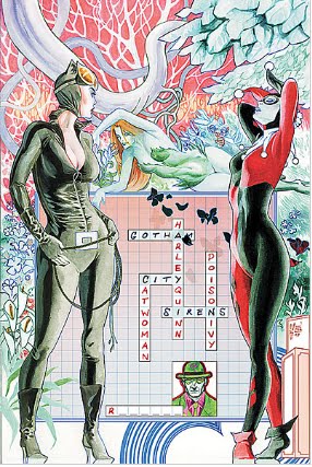
2. The anatomy of these women should be drawn correctly and accurately, and not distorted solely to show off their assets. Gotham City Sirens has been a particularly bad offender on this point, with contorted poses that cannot be duplicated by the human body. Many drawings of Power Girl, well-known for her impressive endowments and the "window" in the chest of her costume, do not seem aware of what such a large bosom would actual look like, and also ignore basic laws of gravity.

In this image: Power Girl. This was in fact drawn by a woman, and one who is generally an excellent artist, but something is definitely off with Power Girl's anatomy.

3. When an artist draws a "cheesecake" shot (an image designed to show off a character's sex appeal), this image should make sense in the context of the story, and should not detract from the dramatic tension of the moment. When, at the end of Zatanna #1, there is a panel of Zatanna undressing as she prepares to relax in the bath after a stressful battle, that's completely fine. It's in-character and appropriate for the calm and sensual atmosphere of the scene. When (and I'm deviating into Marvel territory here, because it's a fine example) there is a panel showing nothing but She-Hulk's posterior in the middle of a tense and politically charged argument, that is not only tasteless, but also distracting to anyone who was actually trying to follow the plot. And even the first, tasteful kind of cheesecake shot should be used in moderation. If half of the pages in an issue are devoted to semi-naked women in plot-irrelevant scenes, then that isn't much of a superhero comic, and it is off-putting to readers of both genders.


In this image: The political commentary of Marvel's Civil War is interrupted by a pointless exhibition of She-Hulk's endowments. From Civil War #2.

31 May 2010

The Return of Bruce Wayne #1 and #2


Essentials:
Written by Grant Morrison
Issue #1:
Pencils by Chris Sprouse
Ink by Karl Story
Colors by Guy Major
Letters by Jared K. Fletcher
Cover by Andy Kubert and Chris Sprouse
Issue #2:
Art by Frazer Irving
Letters by Jared K. Fletcher
Cover by Andy Kubert and Frazer Irving

Verdict: Four bats out of five

In these first two installments of the long-awaited Return of Bruce Wayne event, the amnesiac Bruce Wayne travels first to Gotham's prehistoric past, then to its early days as a Puritan colony, while a quartet of time-traveling heroes try to stop him from inadvertently destroying the world. Most of the story makes very little sense, and yet that doesn't detract from the sheer fun of the miniseries.

The entirety of The Return of Bruce Wayne #1 can be summed up in a four-word sentence: Batman is a caveman. The entirety of The Return of Bruce Wayne #2 can be summed up in a three-word phrase: Batman with witches. Rather than developing the character of Bruce Wayne further, Grant Morrison relies on the sheer "
cool factor" to keep the reader interested.

Usually, that doesn't work.

It worked.

Return of Bruce Wayne is ostensibly the explanation for what happened to Bruce Wayne after Final Crisis. Every issue, there is
a brief scene with the four heroes who are following Bruce Wayne (Superman, Green Lantern, Booster Gold, and Rip Hunter), which attempts to provide exposition. It's pretty boring. The problem is that the scenes are too short to actually give these characters any attention, which is a shame, because the heroes themselves are quite interesting. And all the relevant exposition can be boiled down to a single fact: for reasons related to Final Crisis, if Bruce Wayne returns to the twenty-first century unaided, it will destroy the world.

"Good to know," says the audience, "Now give us more cavemen."

While all the technobabble and exposition is of course important for the purpose of the overarching story, it's not nearly as interesting as the reality-bending romp through time
that is the main point of the miniseries. Return of Bruce Wayne #1 features an amnesiac Bruce Wayne joining forces with a tribe of cavemen to fight against Vandal Savage, and even features a young caveman who fills the role of Robin. It mostly consists of a lot of fighting, without much complexity. But because it's Bruce Wayne wearing a giant bat-skin fighting cavemen, it's awesome. Also, there's a nice scene in which he growls at the mention of the name "Joker," indicating that he may not have completely lost his memories.

Return of Bruce Wayne #2 is a bit less interesting than the first issue. It suffers from a lot of the cliches common in stories set in colonial times: there's a mysterious magical woman in the woods, there are unthinking, prejudiced witch-hunters who want to kill her, and there is a singular, intelligent man who is an unheeded voice of reason (in this case, Bruce Wayne). Bruce spends a lot less time being Batman, although he does get a chance to show off his detective skills. On the plus side, this issue has the first hint of Bruce Wayne leaving clues for his twenty-first century allies to find.

Artwork
The art of Return of Bruce Wayne #1 is fairly standard. There isn't anything particularly innovative or interesting about it, but it isn't bad. The second issue has a much more surreal art style that is a bit evocative of DC's Vertigo imprint, and it fits well with the almost Lovecraftian
overtones of the story. The only women so far portrayed in the series have been in Puritan garb, so there hasn't been much opportunity for sexual exploitation. The next issue, due out on June 16, will no doubt involve some pirate wenches, so there may be more to discuss when that comes out.

Results of the Costume Poll

The results of the poll are in! Eleven people voted in the poll on skimpy costumes, and the results are as follows:

What do you think of skimpy costumes on female comic book characters?
I love them! - 1 vote - 9%
They're okay in moderation - 6 votes - 54%
They're always sexist - 4 votes - 36%
I don't care - 0 votes - 0%

In an attempt to increase the sample size, I posted a similar poll on the forum for ThatGuyWithTheGlasses.com, which is home to a lot of opinionated comics fans. The results there were as follows:

What do you think of skimpy costumes on female comic book characters?
They're always awesome! - 2 votes - 17%
They're okay in moderation - 8 votes - 67%
They're always sexist - 0 votes - 0%
Ooh, shiny poll! - 2 votes - 17%

Combining the two polls, I collected a total of 23 votes. 14 people--61% of everyone polled--think skimpy costumes are all right in moderation. 4 voters believe such costumes are always sexist, while 3 voters think they're always a good thing. And two people just like voting in polls.

This poll has generated a lot of thought-provoking comments. A more in-depth examination of fanservice and sexism in comic book art will be posted within the next few days.

24 May 2010

Red Robin #12

Essentials:
Published May 5, 2010
Written by Christopher Yost
Pencils by Marcus To
Ink by Ray McCarthy
Colors by Guy Major
Letters by Sal Cipriano
Story Title: "Collision - The Conclusion"

Verdict: 5 bats out of 5

Red Robin at last comes face to face with Ra's Al Ghul, as the League of Assassins descends on Batman's associates. All the plots of the last year come to a head, and the smoke clears to reveal that Tim Drake-Wayne is simply awesome.


Ra's Al Ghul is not one of Batman's most high-profile villains, despite the increase in his popularity after Batman Begins. He's not as unique as Two-Face or as menacing as the Joker. However, there is still something very intimidating about a man who controls a worldwide network of ninja assassins and theoretically lives forever. (Why isn't he used more? Not that Liam Neeson wa
sn't amazing in the movie, but the movie version of Ra's Al Ghul was too much of a well-intentioned terrorist and not enough of an immortal ninja, and then he got killed off.) He's also one of the few villains to know Batman's true identity consistently, with no convenient bouts of amnesia to stop him from targeting Bruce Wayne as much as the Dark Knight.

Ra's Al Ghul has been swearing revenge against former Robin Tim Drake-Wayne since Tim blew up the League of Assassins in Red Robin #8. In this issue, readers finally get to witness Al Ghul's attempt at revenge, and Tim's plan to stop it. When the fans anticipate something for so long, it can be difficult for the actual event to live up to their expectations.

It was AWESOME.


Tim's actions in this issue remind anyone who might have forgotten that he is the boy who deduced the identities of Batman and Robin when he was nine years old. He doesn't go blindly into the fight; he develops a strategy and contacts his allies, sending his friends from the Teen Titans to stop the League of Assassins from killing Bruce Wayne's loved ones. This leads to the greatest two pages in the entire issue, as Superboy, Kid Flash, Manhunter, Batgirl, Huntress, Man-Bat, Wonder Girl, and Robin call in to report that they have defeated every one of the assassins.
Robin, Ra's Al Ghul's assassin-trained grandson, has this to say:

He gets bonus points for using the proper plural form of "ninja." Also, note that Marcus To belongs to the very short list of artists who can draw Damian Wayne well.

With the first step of Al Ghul's plan foiled, the villain takes a more direct approach: epic swordfight. This scene shows the character traits that make Tim a worthy member of the Batfamily: he is determined, honorable, and--above all--self-sacrificing. Tim risks everything, even his own life, to stop Ra's Al Ghul from hurting Bruce Wayne's legacy. Christopher Yost understands the true essence of Tim's identity as a superhero and his role as Batman's protege. Ra's Al Ghul
shows his own admiration of Tim's abilities when he calls Tim "detective," a moniker he normally reserves for Bruce Wayne. The final pages of the comic further emphasize Tim's role as Bruce Wayne's successor, as Ra's Al Ghul reveals to the audience that these events have been a test of Tim's worth--a test much like those that Al Ghul had previously devised for Bruce Wayne.

Artwork:
Artists of
Gotham City Sirens, take note: THIS is how you draw attractive women. The girls in Red Robin have a variety of body shapes, and the art makes them look good in skintight costumes without being exploitative. (The same goes for the men, actually. Tim spends a lot of time with a ripped costume, or lacking a shirt, without it feeling gratuitous.) Marcus To is one of the most consistently good pencillers working with the Batman family. His excellent grasp of anatomy extends to everything from quiet moments in the Batcave to the desperate fight between Red Robin and Ra's Al Ghul.


As a bonus, have a clip of Ra's Al Ghul swordfighting with Bruce Wayne, from the Warner Brothers' official YouTube Channel:

23 May 2010

Audio Review: Batman and Robin #12

Introducing the special audio edition of the DC Dissection! I apologize if the audio quality isn't the greatest; your humble reviewer is still learning how to use the microphone. Here is a transcript of the review, if you wish to read along.


A few links pertinent to this review:
  • The Wikipedia definition of "retcon."
  • The TV Tropes page describing the character type of The Mad Scientist's Beautiful Daughter. (Be warned that TV Tropes is very entertaining and can consume a great quantity of a person's time.)
  • Linkara's review of Youngblood #1, in which he diagnoses the phenomenon known as Youngblood's Disease.
So then, Gentle Readers, what do you think? Should the DC Dissection stick to text reviews, or do you enjoy the audio format?

10 May 2010

Gotham City Sirens #10

Essentials:
Written by Paul Dini
Pencils by Andres Guinaldo
Inks by Raul Fernandez
Colors by Ian Hannin
Letters by Sal Cipriano
Cover by Guillem March

Verdict: 4.5 bats out of 5

Catwoman, Poison Ivy, and Harley Quinn discover the culprit behind the corpse that dropped through their skylight in Sirens #9, while the Riddler spends most of the issue trapped in a cage surrounded by wild beasts.


Gotham City Sirens has had a major focus on the Riddler since the beginning (in June 2009), but Paul Dini gives the former villain a much more balanced portrayal than his appearance in Batman #699. The first time Sirens featured the Riddler, Poison Ivy had enthralled him with her pheromones in order to steal his apartment. Instead of a triumphant entrance, resplendent in a green suit, Riddler first appeared in his boxers on a couch, dazed and drooling: not the most dignified of moments. While the Riddler has long since shaken off Ivy's control--and he's not happy about it--he isn't the spotlight-stealing private eye that he was in Batman. When the Sirens came to the Riddler for assistance last issue, the case could have been a rehash of previous Riddler/Hero partnerships, but it quickly becomes apparent that the girls were only using him as bait to draw out the villain. The Riddler is still clever enough to deduce the identity of the girl Doctor Aesop had murdered, and he does talk Aesop into eventually letting him out of the cage. He's not out of character, but he doesn't take too much attention away from the heroines.

Doctor Aesop appeared once before in the DC Universe, during the "Heart of Hush" storyline of Detective Comics. He's a rather standard gimmick-based villain, the sort that wouldn't have been out of place in the 1960s Batman television series. However, he manages to be a genuine threat--even an old man with a cane can be frightening when he has a pack of lions and wolves at his back. (Especially when said old man has been trained in Portuguese cane-fighting.)

Artwork
There seems to be a curse on Gotham City Sirens. No artist, no matter how skilled they are on other titles, can draw the main characters correctly. Catwoman, Poison Ivy, and Harley Quinn are known throughout comics for their skintight and/or skimpy costumes, and so one expects some "fanservice" scenes designed to show off their physique. However, the art on Gotham City Sirens shows off the female bodies in such a way that is not only gratuitous but also anatomically incorrect. Harley Quinn especially seems to contort her body in ways that cannot possibly be comfortable. The depiction of the female protagonists is the one downside of Gotham City Sirens.
A personal anecdote: When this reviewer bought the first issue of Gotham City Sirens, the male comic shop owner apologized for the art, because even he noticed how gratuitous the sexualization was. For a comic starring three spandex-clad women, an artist has to go pretty far for his art to be deemed "gratuitous."

What say you, Gentle Readers? Is there such a thing as too much fanservice? Give your opinions in the comments as well as in the poll on the sidebar. We'll touch on this issue in more detail in a later post.

04 May 2010

Spotlight on Free Comic Book Day


Few days hold greater joy in a geek's heart than the first Saturday in May. Since 2002, comic book shops the world over have hosted an annual Free Comic Book Day, a day not only for the acquisition of unique comics but also for socialization with fellow comic book fans and an excuse to dress up in silly costumes. Several major publishers, including DC Comics and its longstanding rival Marvel, release special comics for store owners to distribute for free.

Free Comic Book Day is not only great fun, but also good business. People who have never set foot in a comic shop before are lured by the promise of free goods (and sometimes free food, as well). They barely get in the door when they notice that comic shops are pretty cool places, full of bright colors and friendly people, and walk out not only with the free merchandise that they were promised, but perhaps other comics that the wise shop owner had on sale specifically to take advantage of the large crowd of customers. Free Comic Book Day is a great chance to introduce new readers to the world of comics.

Comic book publishers are not idiots, and they do not let this opportunity pass them by. DC had two releases this year: War of the Supermen #0, which continues as a regular series this month; and DC Kids, an anthology of DC's kid-friendly titles. Both of these comics have the very specific intention of enticing readers to pick up the regularly-priced issues. It's a marketing ploy, of course, but it's a marketing ploy that introduces people to new and exciting comic books.

Free Comic Book Day is excellent publicity for less-known publishers, as well. Some of the best of this year's free comics came not from DC and Marvel, but from companies that few have heard of outside the industry. One of the best offerings from this year's Free Comic Book Day came from Archaia Comics. Archaia's free comic featured two stories: one from its long-running series Mouse Guard and one from a new title starting this month, Fraggle Rock.

Plenty of the adult patrons coming into the stores for Free Comic Book Day grew up watching Jim Henson's Fraggle Rock when it first aired in the 1980's, or when it reran on the Disney Channel in the 1990's. While the new Fraggle Rock comic is ostensibly for kids, it relies heavily on the power of nostalgia, bringing back the spirit of Muppet-filled fun, and it succeeds; this first taste of Fraggle Rock has all the charm of the old show. The only downside is that a comic book cannot duplicate the wonderful music of the original.


This video is from the Jim Henson Company's official YouTube page. Fraggle Rock is the property of the Jim Henson Company.